Migrating my photography blog with AI: Lessons in iterative development
I recently migrated my photography blog from Tumblr to Jekyll with help from Claude Code. The project took a few hours and involved migrating 85 posts, optimizing 839 MB of images, and building a custom blog section. But more interesting than the technical outcome was learning how to effectively work with an AI coding assistant.
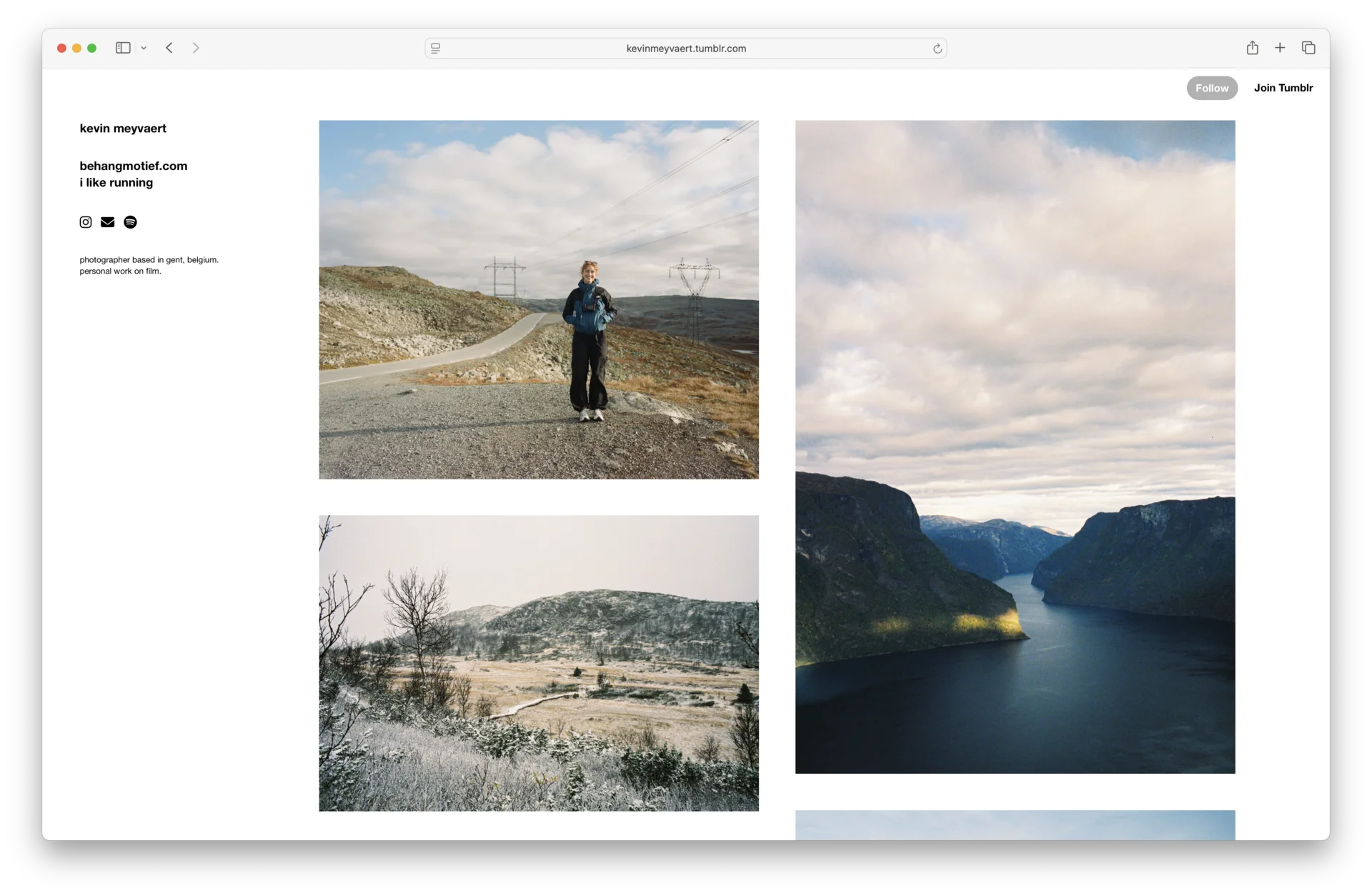 This is a screenshot from my Tumblr. Looks familiar?
This isn’t a tutorial. It’s a reflection on what works (and what doesn’t) when building something real with AI.
Starting with context
My first prompt was straightforward:
“I created this fresh Jekyll project. I have a Tumblr blog at the moment, but I want to migrate it to a Jekyll setup so I can host it on my GitHub. First of all, I want you to analyze my current setup on Tumblr and recreate the layout as it is today. The url of the blog is kevinmeyvaert.be”
What worked here: I provided the actual URL instead of describing the design. I stated the end goal (GitHub Pages hosting). I asked for analysis first, implementation second.
The AI analyzed my Tumblr theme and started building. But immediately, we hit the first lesson.
Visual feedback beats everything
The initial build looked clean but wrong. Instead of my sidebar navigation, it created a horizontal header. I could have written a paragraph explaining the difference, but instead:
“The first image is my tumbler, which you can see has a sidebar. And the second image is what you created, which has a header and no sidebar. Please make the desktop version look like the tumbler one.”
Two screenshots. One sentence. Problem solved.
Lesson: When something doesn’t match your vision, show it. Screenshots, mockups, or rough sketches communicate infinitely faster than descriptions.
The masonry grid saga
This is where things got interesting. My Tumblr blog used a masonry layout. Images of different aspect ratios flowed naturally into two columns. Simple to see, harder to build.
The AI initially used Masonry.js, a popular JavaScript library. It worked, but loaded all 85 images at once. The page took forever to load.
Next attempt: CSS Grid with calculated row spans based on image aspect ratios. This should have worked. But instead, I got massive gaps between images. Huge, unusable vertical spaces.
I tried giving feedback:
“The gaps are huge now (they got bigger since last change)”
Still broken. Time for directness:
“maybe reevaluate your approach ultrathink”
This moment taught me the most important lesson: When you’re stuck in local optimization (tweaking values, trying variations), sometimes you need to step back entirely. Don’t be polite. Be direct. “This approach isn’t working” is valuable feedback.
After my prompt, the AI switched approaches entirely to CSS multi-column layout:
.photo-grid {
  column-count: 2;
  column-gap: 30px;
}

.photo-item {
  break-inside: avoid;
  margin-bottom: 30px;
}
Perfect. Zero JavaScript. True masonry effect. The right solution was simpler all along.
Lesson: Don’t get attached to the first approach. If something fundamental isn’t working, say so and explore alternatives.
Asking for best practices
I had 839 MB of images sitting in the project. I didn’t know if Jekyll had built-in optimization, so I asked:
“The images that we’re showing now on the website are pretty big. Does Jekyll offer some kind of image optimization plugin or resizer so we can ship more reasonably sized images?”
The AI recommended jekyll_picture_tag, configured it for AVIF/WebP/JPEG with multiple responsive sizes, and ran the optimization.
Result: 839 MB to 21 MB (97.5% reduction)
Lesson: You don’t need to know every solution. Ask about best practices for the problem you’re trying to solve. “Does X have a way to handle Y?” is a powerful prompt pattern.
When constraints change plans
Later in the project, I wanted better URL structure. The blog listing was at /blog but individual articles used /articles/article-title. Confusing.
My request:
“It’s kind of confusing that the overview of the blog is slash blog, but that the detailed pages are slash articles. Can you align those?”
The AI suggested renaming _posts to _photos for consistency. We did it. Then discovered: the standard jekyll-paginate plugin only works with _posts directory, and GitHub Pages doesn’t support the v2 plugin that handles custom collections.
We had two options. Use GitHub Actions for custom builds (complex). Keep _posts as the directory name (simple).
I chose option 1: keep it simple. The URLs are clear even if the directory name isn’t perfect.
Lesson: Real projects have constraints (hosting limitations, plugin compatibility, deadlines). Perfect architecture sometimes loses to practical shipping.
Prompting patterns that worked
Looking back at the conversation, the most effective prompts were:
Incremental and specific. Not “Make my site better” but “Can you make the pagination navigation more subtle?”
Visual when possible. Not “The layout should have a sidebar on the left” but [Screenshot] + “Please make it look like this”
Direct about problems. Not “The spacing seems a bit off” but “The gaps are huge now, maybe reevaluate your approach”
Context-rich for complex requests. Not “Add a blog” but “I want a separate page on my blog where I can post technical blog posts. These articles shouldn’t appear in the feed of photos on the homepage.”
Questions over commands. Not “Implement image compression” but “Does Jekyll offer some kind of image optimization plugin?”
What we built
In a few hours:
We migrated 85 photo posts from Tumblr HTML. We optimized and served responsive images (AVIF/WebP/JPEG). We built masonry grid with pagination (10 photos per page). We added separate blog section for technical writing. We made it all GitHub Pages compatible.
The conversation had ~50 exchanges. Most were quick iterations and refinements.
Takeaways for AI-assisted development
Start with context. Give the AI your actual URL, existing code, or screenshots. Context beats lengthy descriptions.
Iterate quickly. Don’t try to specify everything upfront. Build, review, adjust. The feedback loop is your friend.
Use visual feedback. Screenshots communicate design intent faster than any written description.
Be direct when stuck. If an approach isn’t working, say “this isn’t working, try something else.” Don’t optimize a bad solution.
Ask questions. You don’t need to know every tool or library. Ask “what’s the best practice for X?” and learn from the answer.
Embrace constraints. Perfect architecture isn’t always practical. Ship the thing that works with your constraints.
Review, don’t just accept. The first solution often works, but not always optimally. The masonry grid needed three attempts to get right.
Want predictable results from AI coding agents? The iterative approach described here works great for smaller projects. For larger codebases and enterprise applications, I’ve developed a more structured approach using NX, module boundaries, and code generators that makes AI-generated code consistently production-ready. Learn more in Architecting for AI: How NX, module boundaries, and code generators transformed my development workflow.
The real value
The final blog works great. But the real value wasn’t the code. It was learning how to collaborate effectively with AI tooling. These patterns apply whether you’re building a blog, refactoring an app, or debugging production issues.
The best collaboration happens when you provide clear context, give direct feedback, iterate quickly, know when to push back, and stay focused on shipping.
Now I have a blog I control, hosted on GitHub, with optimized images and clean URLs. And I learned a better way to work with AI in the process.
You can view the final result at kevinmeyvaert.be and the source code on GitHub.